The battle for market share between Apple and Google continues to rage, with Apple releasing their new iPad Mini in competition with other manufacturers’ smaller, cheaper hardware. Both Google and Samsung are tipped to be releasing new 10-inch machines into the marketplace.
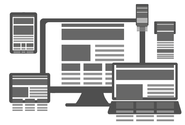
With the variety of available hardware already in the hands of consumers, content generation now has to display gracefully across a plethora of screen sizes and resolutions.
Planning
Take your time deciding what your site will do and what information you are going to be sharing – define your target audience.
The same user who browses your site via a desktop will browse it very differently on a mobile.
Why?
Because he is mobile; walking around, listening to music, updating his social content, boarding and alighting transportation. On the move.
Take your time decide what content is going to be shown and what is superfluous. Content first, layout second – then move on to the sitemap.
You don’t have the luxury of space here, and buttons and links need to be big enough for a fat finger to get at. Your average finger area measures around 44x44px (minimum 30px).
Wireframes
Wireframes are a must. There is often a considerable amount of information that needs to span each page of your responsive site; constructing each and maintaining a coherent flow of information alongside a logical, simple navigational structure is paramount when considering users utilising mobile systems
White Space
It is a small screen – but fight the urge to cram everything into it. Use white space for a clean and tidy look that is easily navigable and pleasing to the eye.
Reduce text entry
Some people can type pretty fast on mobiles and others are all thumbs. Reduce text entry by using dropdown menus, pre-populating fields and checklists.
Swipes
Don’t forget swipes as they are very handy and are easily forgotten.
Tracking
Alas your now lovely website is not quite complete and it requires ongoing improvements. You have just come a full circle and it is time to monitor, analyse and improve on user feedback to identify changes and new feature requests.
On top of that you should periodically evaluate it against your competitors to ensure you are at the top of your game.